amoCRM
Want to win a job like this?
This customer received 17 stationery designs from 5 designers. They chose this stationery design from REDcrackers.com as the winning design.
Join for free Find Design Jobs- Guaranteed
-
 US$310
-
 17 designs
-
 5 designers
Stationery Design Brief
There are 4 projects which should be in actually a common (very similar) logo, composed of stylized prefix, and the title (though, if this is just the same stylized names may also be appropriate). Their main external difference - the color. Each project has its own color.
- amoCRM.com (blue)
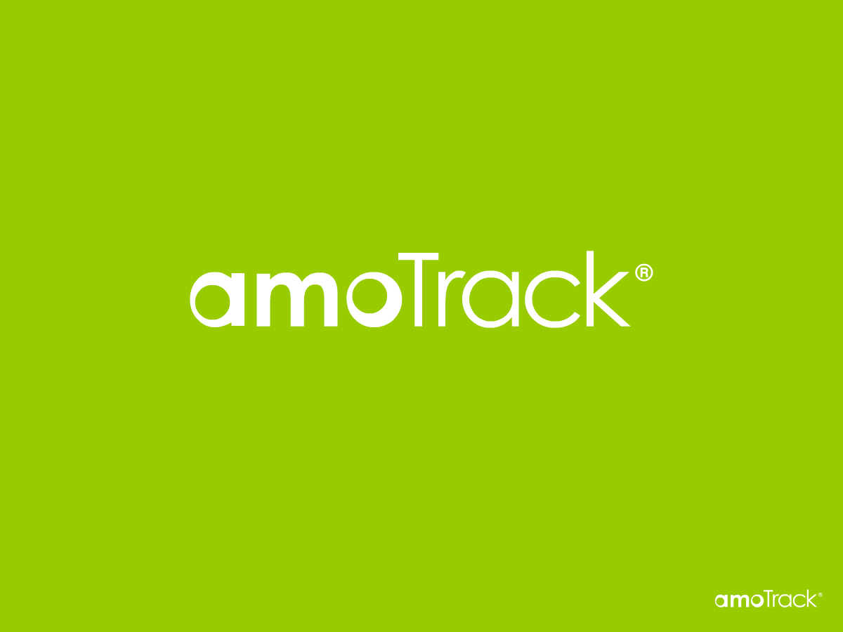
- amoTrack.com (green)
- amoFlow.com (red)
- amoPort .com (orange)
The logo should be "fun" or "web2.0 style", for example as Skype or a little more business, Facebook (although the first option is preferred)
We would like the logo been in spirit of our projects - a simple, understandable and even funny. We want to make the project looks like an alternative (as the antipode) heavy corporate solutions from major vendors.
We are SaaS (software as a service) provider.
Target Market(s)
entrepreneurs, freelancers, small businesses, and groups inside big organizations
Industry/Entity Type
Business
Logo Text
amoCRM
Logo styles of interest
Emblem Logo
Logo enclosed in a shape
Pictorial/Combination Logo
A real-world object (optional text)
Wordmark Logo
Word or name based logo (text only)
Look and feel
Each slider illustrates characteristics of the customer's brand and the style your logo design should communicate.
Elegant
Bold
Playful
Serious
Traditional
Modern
Personable
Professional
Feminine
Masculine
Colorful
Conservative
Economical
Upmarket
Requirements
Must have
- See
skype.com
twitter.com
facebook.com
designcrowd.com
Should not have
- love themes, hearts and etc
No gradient, no backlight!
Good luck